Color plays a bigger role in home design than just aesthetics – it influences how a space feels and how you feel in it. The right color palette can energize a room, create a sense of calm, or make a small space feel open and airy. At T&K Contractors, we believe that thoughtful color choices are a powerful tool in bringing a space to life. Whether you’re remodeling one room or your entire home, here’s how to choose a color palette that aligns with your home’s energy and your personal style.
Start with How You Want to Feel
Before diving into swatches, think about the mood you want to create in each space. Color has a psychological impact, and certain tones can evoke specific feelings:
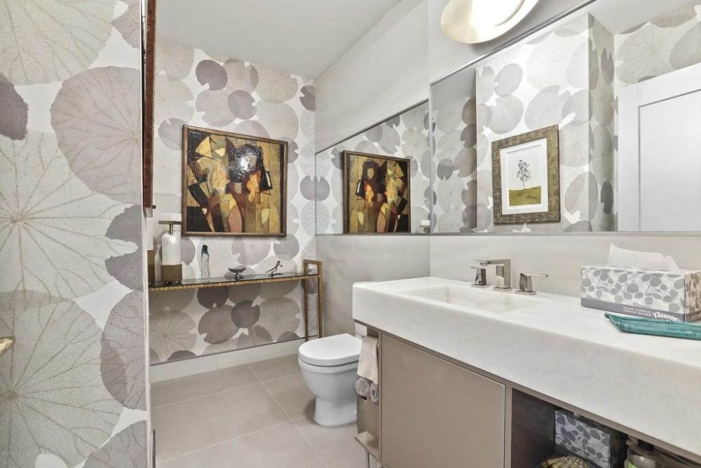
- Calming & Serene: Soft blues, warm whites, muted greens, and cool grays help promote relaxation – ideal for bedrooms, bathrooms, or quiet reading nooks.
- Energizing & Uplifting: Yellows, corals, and vibrant greens bring a cheerful, active vibe – great for kitchens, playrooms, or home gyms.
- Warm & Welcoming: Earthy tones like terracotta, beige, and warm browns make spaces feel cozy and inviting, especially in living rooms or entryways.
- Sophisticated & Grounding: Deep navy, charcoal, or forest green can add drama and elegance to a space, especially when paired with rich textures and materials.
By defining the energy of each room, you’ll have a better guide for building a cohesive and intentional color palette.
Consider Natural Light
Natural light has a major effect on how paint colors appear. A shade that looks warm and soft in a sunlit room may feel dull or heavy in a darker space. Rooms with:
- Southern exposure typically get the most consistent light – most colors work well here.
- Northern exposure offers cooler light, which can make colors appear more muted – go warmer to balance it.
- Eastern or western exposure changes throughout the day – consider how the space will be used and at what times.
Always test paint samples on your walls and view them at different times of day before making your final decision.
Balance Neutrals with Accent Colors
Neutrals create a foundation of calm and flexibility in a space, while accent colors inject personality and energy. You might choose soft taupe or crisp white walls and pair them with navy blue cabinets, sage green built-ins, or bold patterned tile. Accent colors work well on:
- Cabinetry
- Doors and trim
- Feature walls
- Furniture and décor
Keep in mind that your color palette doesn’t need to be made up of just paint – materials, finishes, and textiles also contribute to the overall effect.
Think About the Flow Between Rooms
Your home should feel cohesive, especially in open floor plans or high-traffic areas. While each room can have its own identity, colors should relate to one another in tone or saturation. For example, if your living room is painted in a soft gray, consider carrying that undertone into the adjacent kitchen with complementary blues or greens. This approach keeps the energy flowing from space to space without feeling repetitive.
Don’t Forget the Finishing Touches
Trim, ceilings, and doors are often overlooked but can help complete the look. Crisp white trim can add contrast and definition, while painting the ceiling in a subtle version of the wall color can make a room feel cozier. For a bold, modern twist, consider painting interior doors in a contrasting accent color.