Color has power. It can brighten a mood, create calm, or energize a space. When planning a remodel or designing a room, your color choices do more than add style. They help shape how your home feels. The right palette sets the tone for the entire space and can even influence how you experience daily life in your home.
So how do you choose a color palette that reflects your energy and brings out the best in each room?
- Start With How You Want to Feel
Every room has a purpose, and the colors you choose should support that. Start by thinking about the mood you want to create:
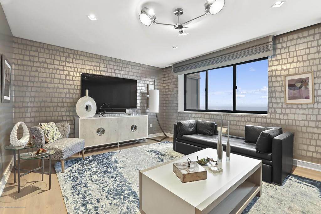
- Living rooms: Soft neutrals, warm earth tones, or muted greens help foster connection and comfort.
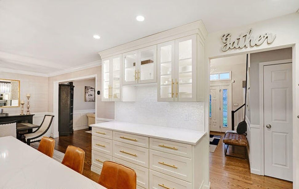
• Kitchens: Whites, warm grays, and natural wood tones keep things fresh and clean, while deeper colors like navy or forest green can create a grounded, modern feel.
• Bedrooms: Blues, soft greens, and warm neutrals are calming choices that encourage rest and relaxation.
• Home offices: Try colors that enhance focus and creativity, such as sage green, warm beige, or even a bold accent wall.
- Understand Warm vs. Cool Tones
Warm colors (reds, oranges, yellows) create energy and coziness, while cool colors (blues, greens, purples) tend to feel calming and spacious. Neutrals like white, gray, and beige can lean warm or cool depending on their undertones.
If your space gets a lot of natural light, cooler tones can help balance the warmth. In rooms with limited light, warm tones can add a sense of comfort and brightness.
- Look at the Bigger Picture
When choosing colors, think beyond just one room. Consider how each space flows into the next, especially in open floor plans. A cohesive palette across your home creates harmony and makes the overall design feel more intentional.
That does not mean every room has to match. Instead, choose colors that complement each other and repeat elements like trim color, flooring, or accent tones to tie things together.
- Don’t Forget the Finish
It is not just about the color itself. The finish matters too. Matte or eggshell finishes absorb light and feel soft, while satin or semi-gloss finishes reflect more light and are easier to clean. This makes them great for kitchens, bathrooms, and trim.
Paint finishes can subtly shift how a color looks and performs in different lighting throughout the day.
- Sample Before You Commit
Paint swatches are helpful, but there is no substitute for seeing a color in your actual space. Test a few options on different walls and observe how the light changes them throughout the day. It is a small step that can save you from costly repainting later.